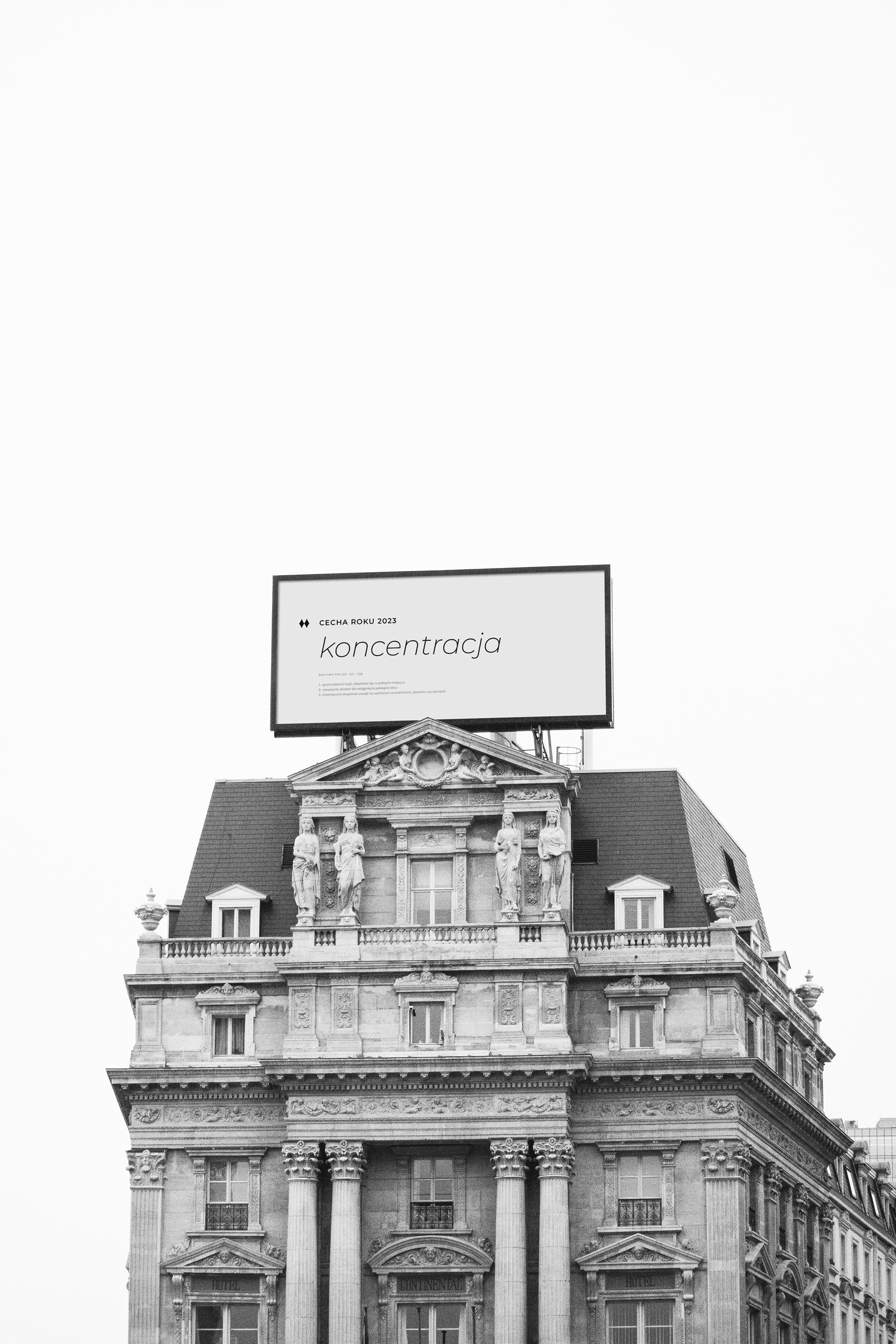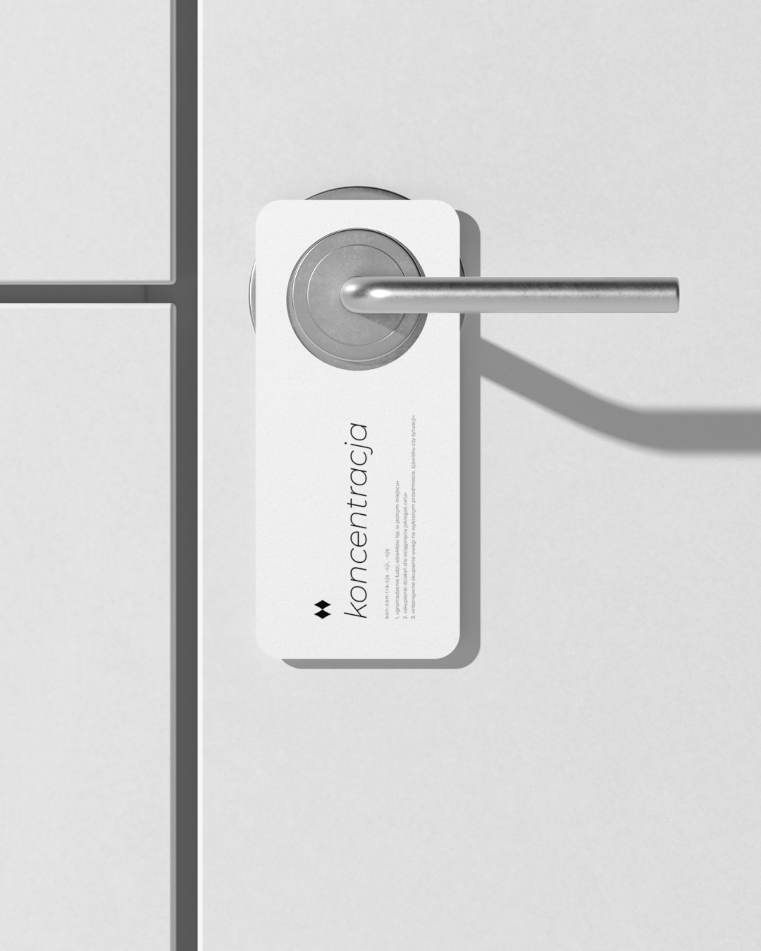
A new logo is a new chapter to me: concentration (koncentracja).
The previous logotype and colors served me for 6 years.
The projects, collaborations, and steps I made during that time began to not fit into the crayon symbol. I am no longer just a graphic designer. The transition to freelance has caused quite a growth! I expanded the scope of my activities and became the head of my own company.
The projects, collaborations, and steps I made during that time began to not fit into the crayon symbol. I am no longer just a graphic designer. The transition to freelance has caused quite a growth! I expanded the scope of my activities and became the head of my own company.
The new logo is a move into the future, even more focus and listening to clients.
Today, together with my new visual identity, I want to offer my current and future clients: understanding, focus on their needs, space to work on equal levels; I want to involve clients in the project so that when they finish the project, they leave with what they really need and want.
Today, together with my new visual identity, I want to offer my current and future clients: understanding, focus on their needs, space to work on equal levels; I want to involve clients in the project so that when they finish the project, they leave with what they really need and want.
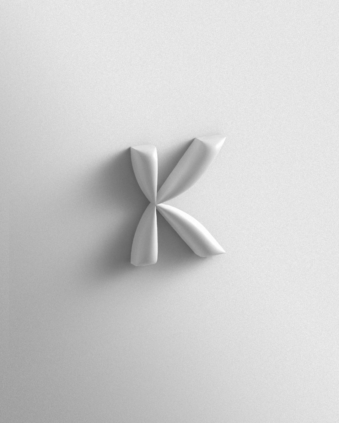
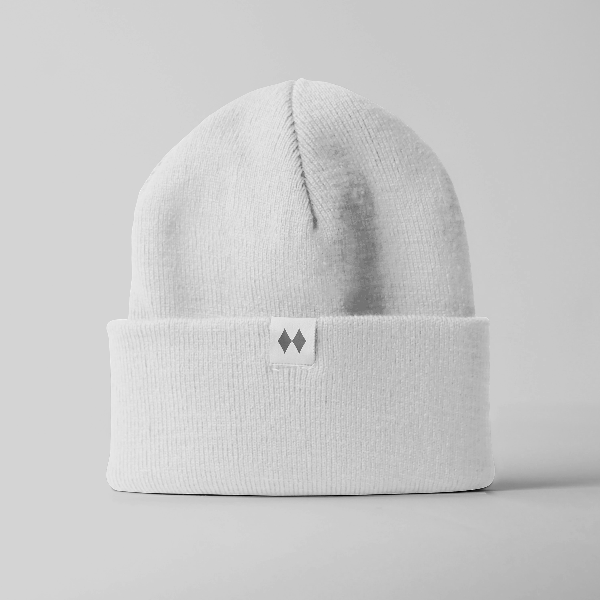
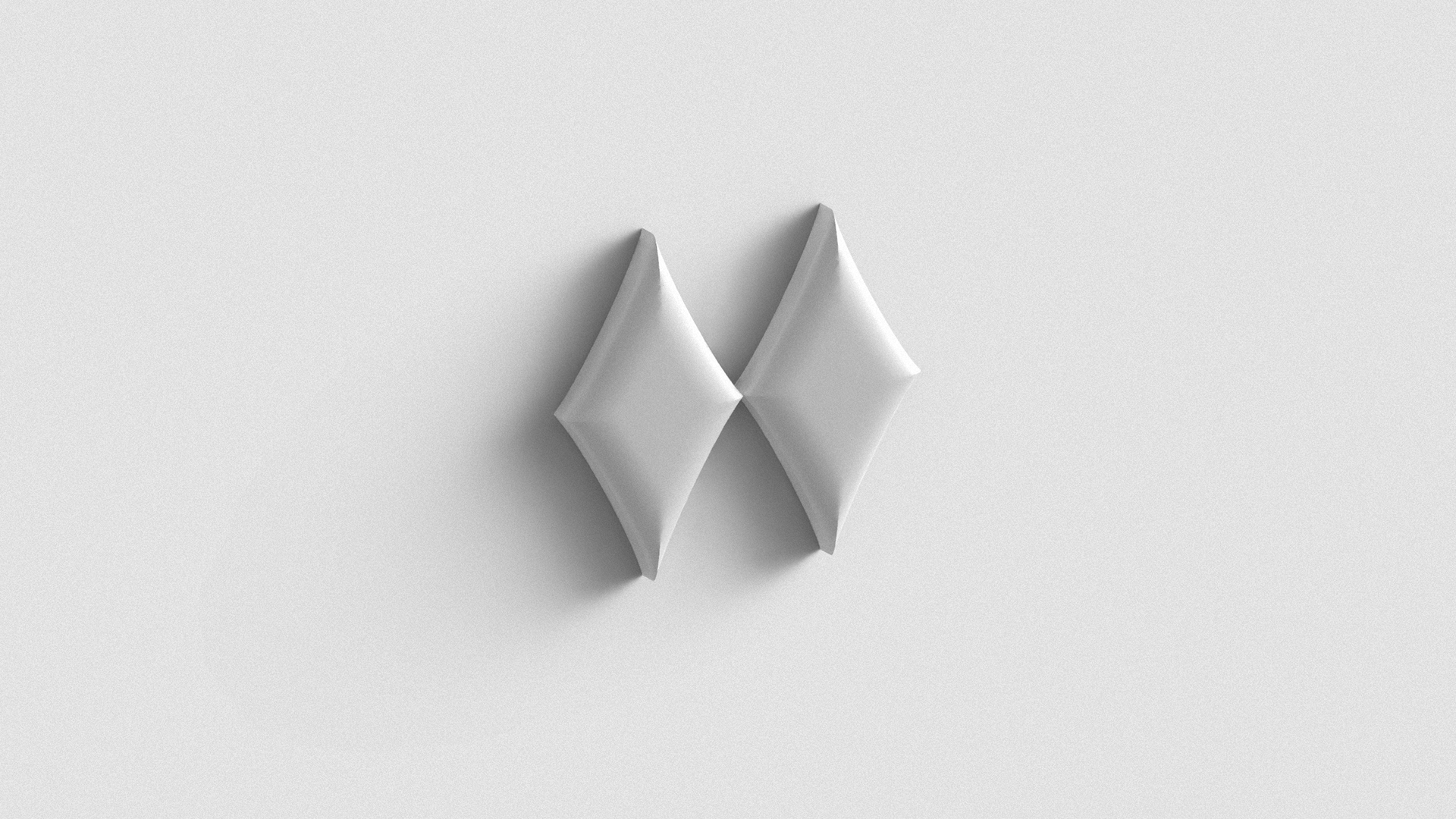
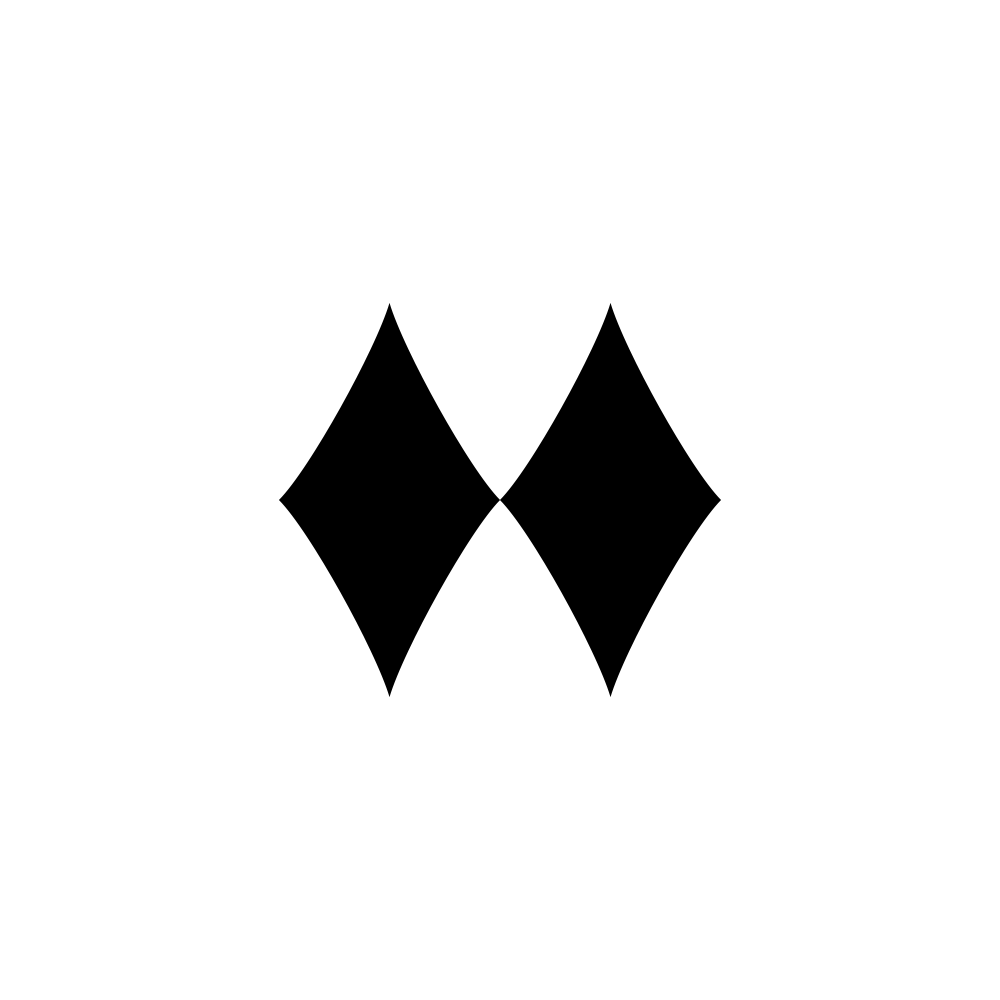
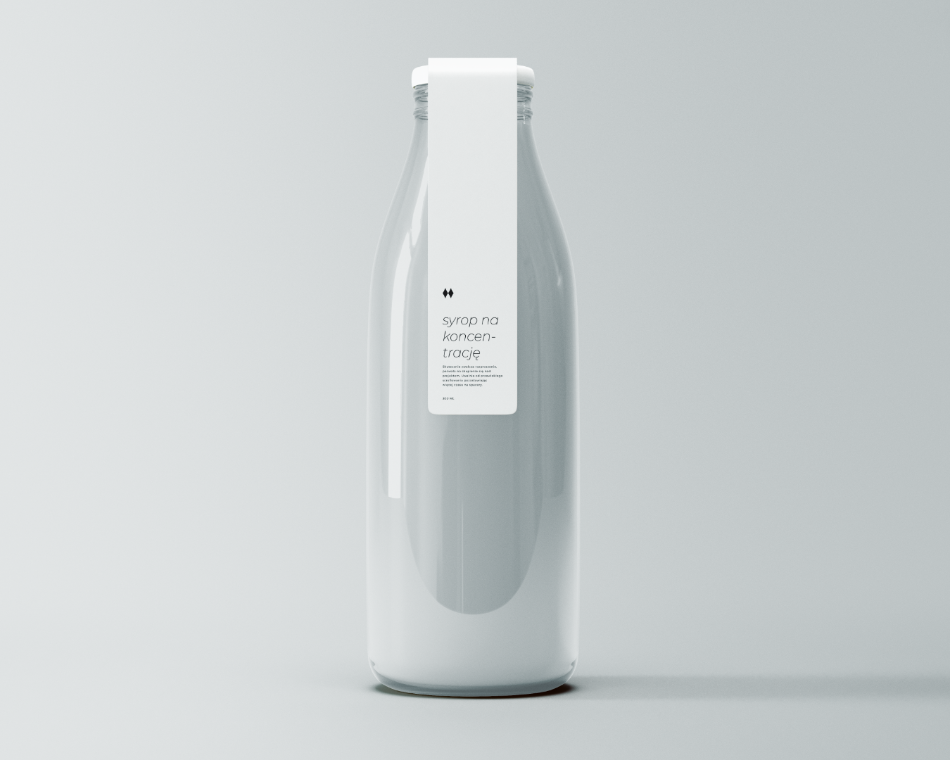
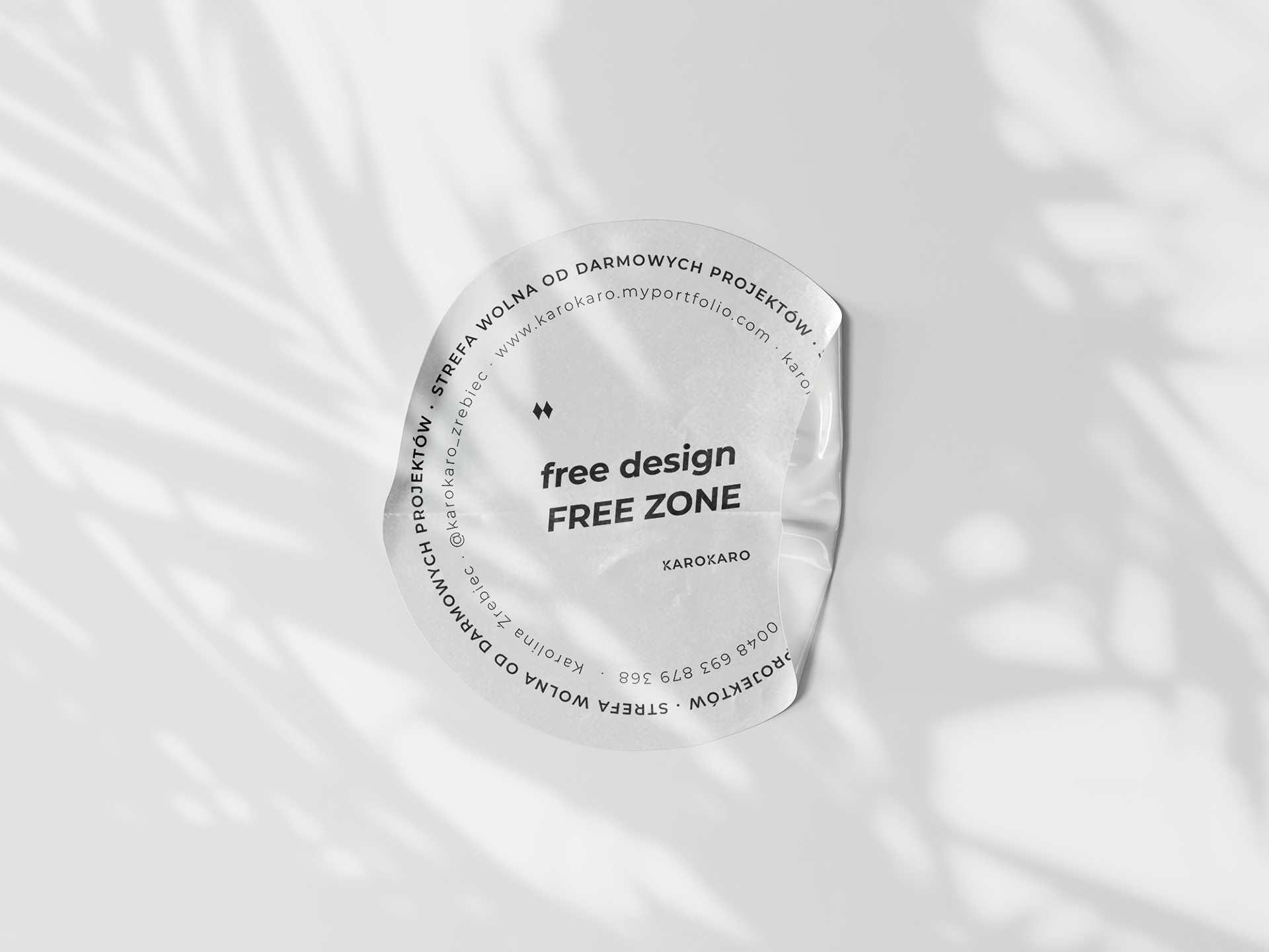
The signet of diamonds stays: now this motif is even more close to me, as I add more cards to the design table.
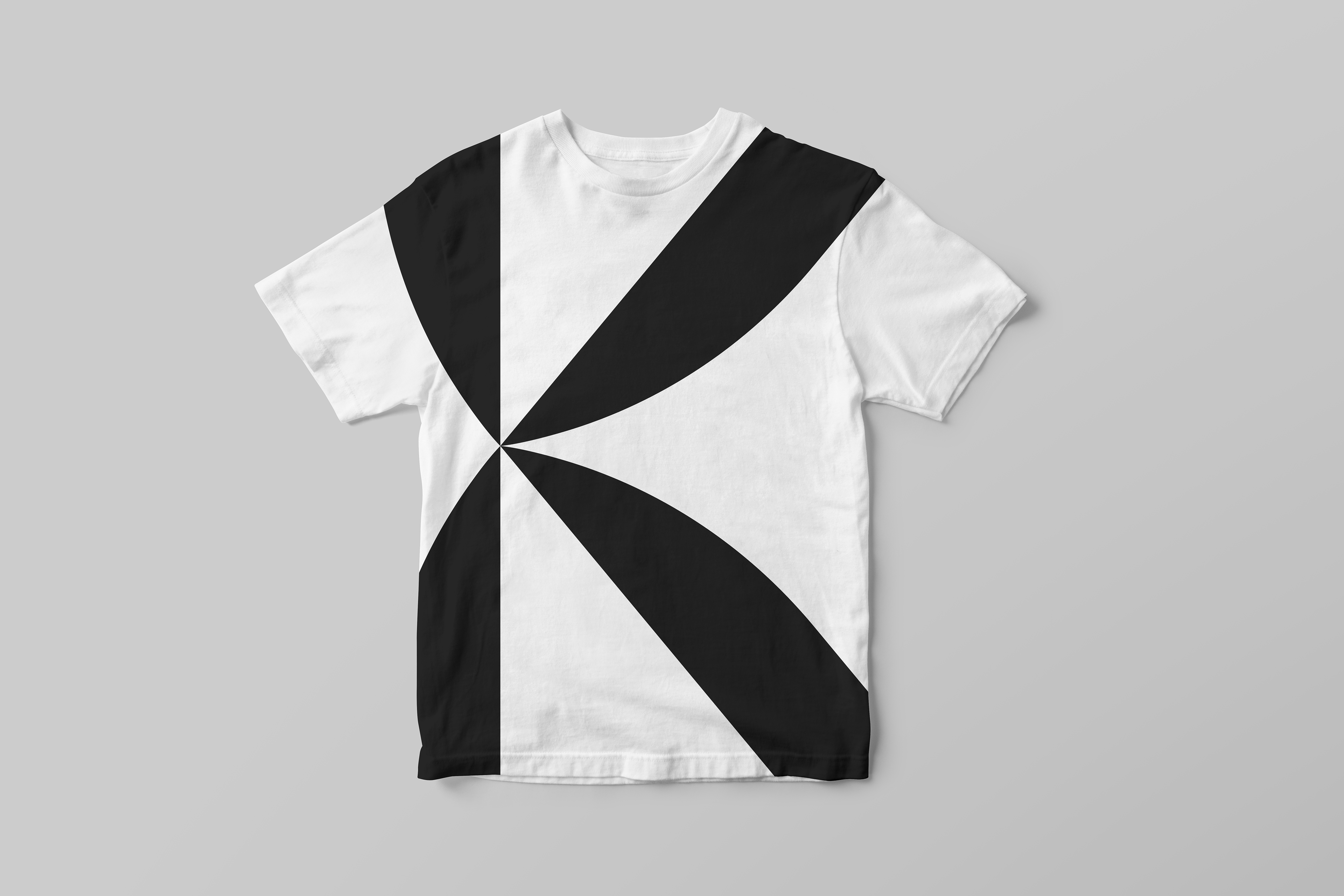
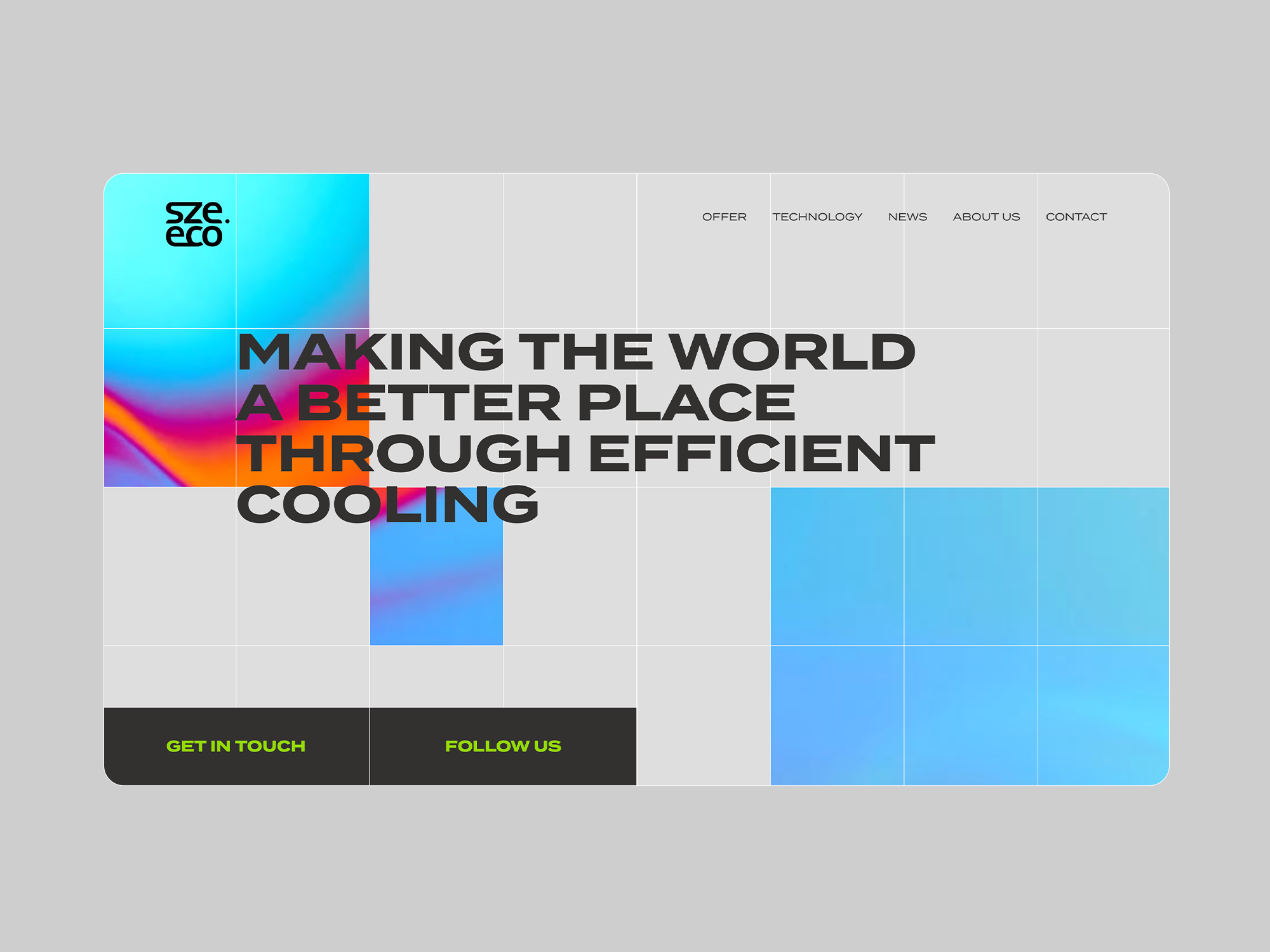
White, black and gray scale replaced the coral color. Why? It's a classic, timeless and versatile color palette that gives a safe space for new branding.
I invite you to cooperate with me!
karolina.zrebiec@gmail.com
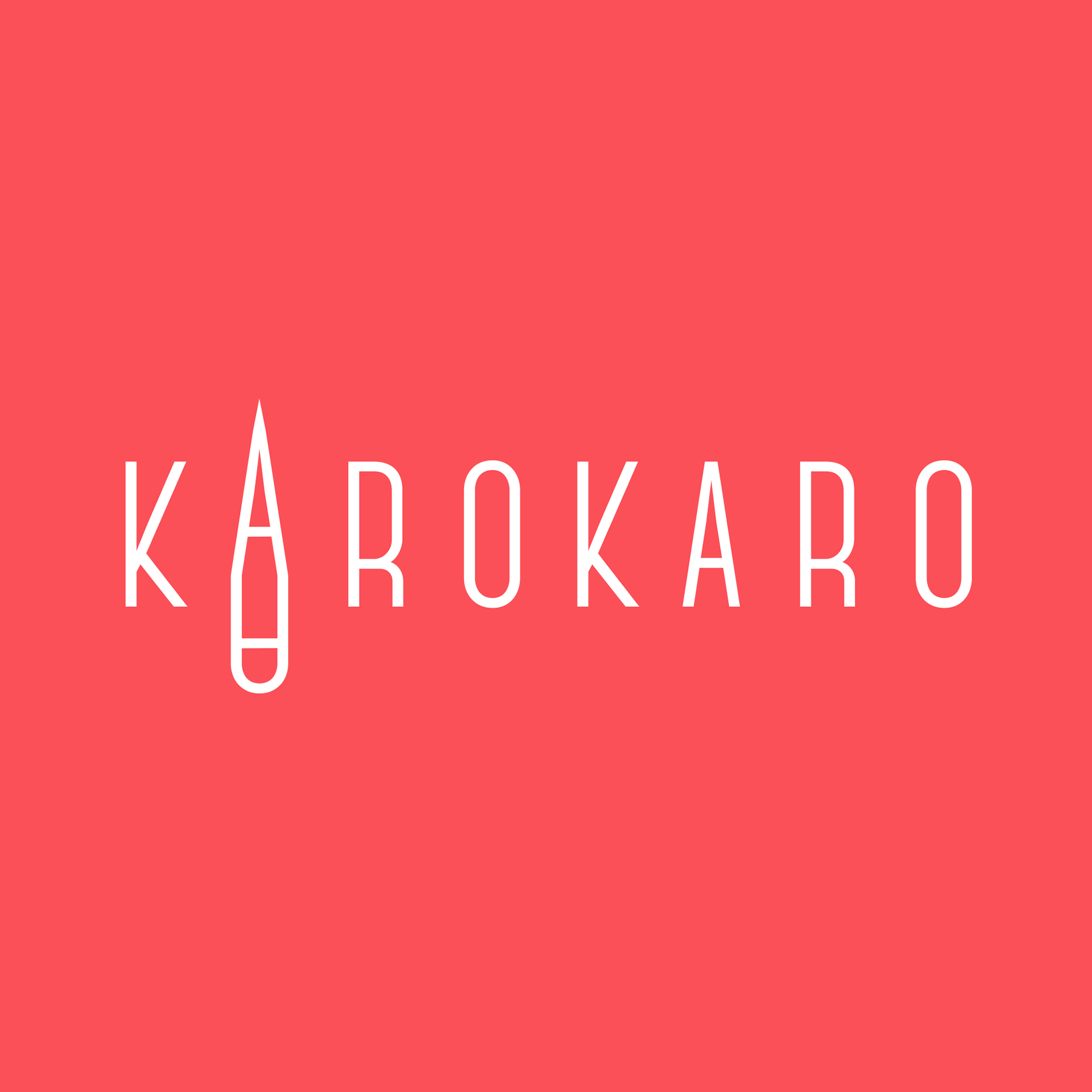
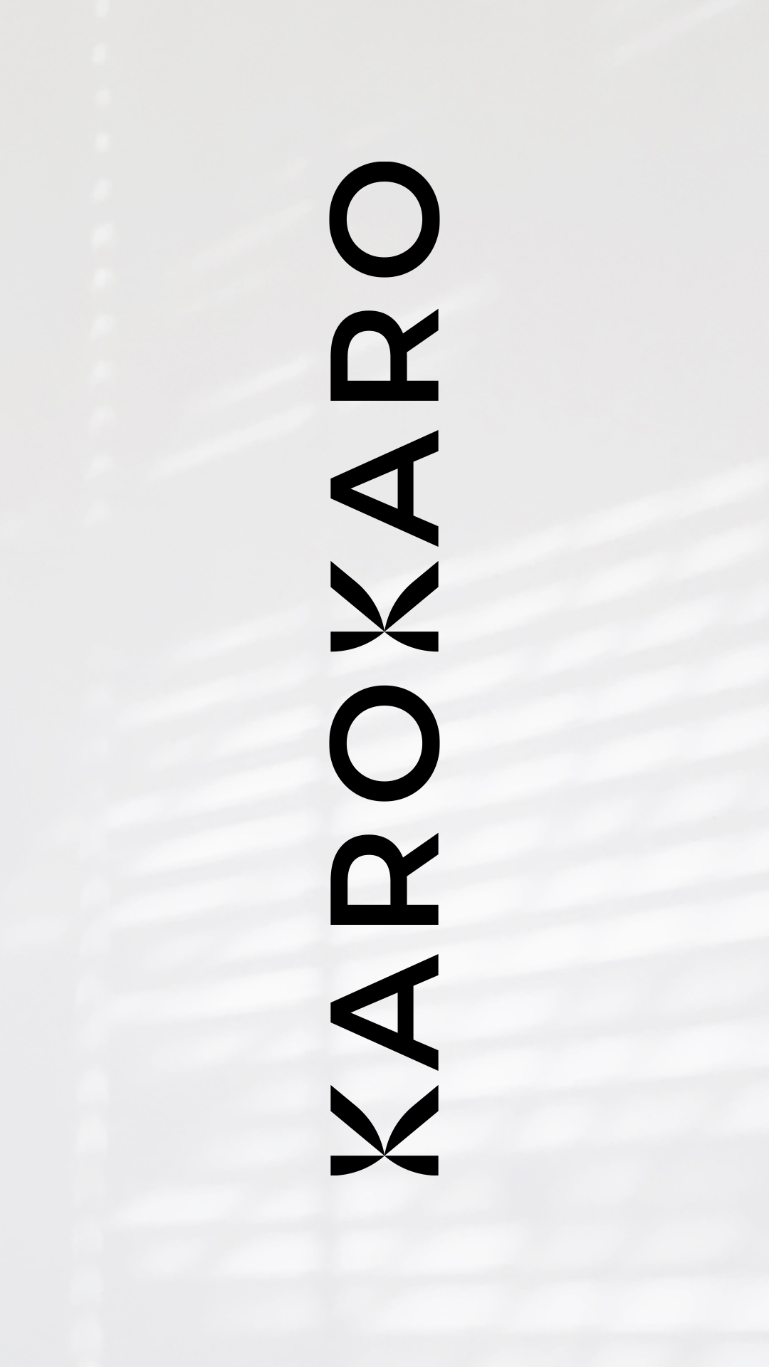
KAROKARO